AddToAny Blog
The Redesign
We’ve given Add to Any a makeover! It’s the same simple, fast-loading interface, but what you see now is much more pleasing to the eye.
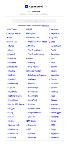
Number one on the design list was ditching all those ‘chicklets’ we collected over the years for a more unified look with ‘favicons’ — the small icons you tend to see in your address bar. They’re more or less little site-specific trademarks. Fortunately, these favicons are all the same size, and we can use them to enhance the aesthetic of our main ‘GUI’ — the huge lists of services.
Number one-point-one on the list was applying the same icons to the rollover/drop-down menus that accompany most new Bookmark and Subscribe buttons. If your buttons already have a rollover/drop-down menu, no code update is necessary to get the new icons — just hit Reload and you should see the new icons.
Number two was to give addtoany.com a little flair. Round some corners, adjust some colors, increase some spacing, add a touch of that magic Add to Any dust, and we were done. Keep it simple.
In this major redesign (hey, it’s major for us!) you might also notice some new great features. More are on their way, and we’ll talk more about all the new features soon in this space.
Let us know what you think about the redesign. Thanks!